2021-2023
Solesmith - Designer & Account Manager
Graphic Based Placement Print Work
The role as designer at Solesmith saw me complete a variety of graphic based placement prints for womenswear, menswear, childrenswear, accessories and homeware. Inspiration came from a variety of sources, whether it the latest popular hobby or sport; a trending saying or phrase; seasonal imagery; or building on the success of a previous style or theme.
Solesmith is predominantly a personalisation brand, so new designs also came with the design feature to factor in a way the customer can personalise the product to make it unique to them or the recipient they are gifting to; whether that by inserting a name, letting them choose a graphic that best represents them, or with a year or star sign. Ensuring these features worked seamlessly within the design was important to make the product feel really special and relevant to the gift recipient.
To achieve these graphics I used a mix of illustrator and photoshop as well as initial hand drawings to plan out designs. Knowing the final output was an important factor in creating new designs, the fabric type and printing method were a big influence in the design, drawing the direction for what colours I could use and the vibrancy and aesthetic of the final printed product. I faced creative challenges to overcome in these processes, new products raised factors in how they could be pressed, what print methods would work on them and how colours would translate from screen to how they would print on the base colour of the fabric. Sampling, testing and adapting designs ensured I could overcome any difficulties and produce successful products.
Dog and Owner Socks - Our Bestselling Sock Design 2022
Following trend research and sales data from previous seasons, I created a pair of Dog and Owner Walking Socks as part of my AW22 range, designing the figures in illustrator and achieving the final product using sublimation printing. Dogs are always a hit seller with Solesmith customers as well as generally in the wider gift market; paired with these gorgeous soft snug socks made exclusively for Solesmith by our supplier, made for a design that was to go on and make great success. Launching initially on our own brand site, this design was later taken by buyers at Getting Personal, Gift Universe, Joules, Next and listed on Not on the High Street as well as being an Etsy top pick. These were immediately popular but went on to being Solesmith's best selling pair of socks for the whole of 2022, despite their late start within the year, and have turned over 5 figure sales.
Expanding in different colours, genders, product types and creating a wheelchair version as requested by a customer, their success is ongoing.
Expanding in different colours, genders, product types and creating a wheelchair version as requested by a customer, their success is ongoing.
Christmas Collection 2022 & Photoshoot Management
For our 2022 Christmas collection I worked with various sources to inspire a range of apparel and homeware for both our own website as well as wholesale accounts. Trend resources supplied by our accounts as well as analysis into previous best sellers gave me a range of inspiration to apply to this collection. Key themes included family twinning, apres ski, and pets (gifts for or surrounding dogs are always a hit); we had also recently invested in a direct to film printer which allowed for a wider range of colours and product bases we had previously been restricted by using only vinyl and sublimation.
For the first time we decided to enlist the help of a professional photographer to capture this collection as we were really proud of it and the business had developed in recent years to allow for the capabilities. I project managed the shoot, working closely with the photographer as well as my boss to bring the photoshoot together, selecting a venue, researching and bringing together moodboards of poses and styling inspiration to send the the photographer as well as to have on hand on the day, and creating a timeline for the day. Prior to the event I worked on coordinating the samples, making sure we had the right products in the right sizes for the models; as well as drawing together inspiration as well as props that we would need on the day. On the day itself I steamed and racked the samples in order to ensure they lined up with the running on the day, and throughout the day I worked with my preplanned timeline to ensure all the photos were achieved. Despite being out all day wearing Christmas jumpers in 35 degree heat, the shoot was a success!
Our talented photographer edited the photographs, making changes with my recommendations, knowing the product as well as the needs of our wholesale customers in the requirements of the photos.
The photographs allowed us to show off the collection to our wholesale accounts, with the products being great sellers on Not on The High Street, Etsy, Next and Friends of Joules.
Smiley Face Emoji Sock Design
For our Valentine's 2022 collection that I designed for Not on The High Street, I took inspiration from the design packs they provide on their seller portal website. Their trend pack 'Liberate' featured bold colours, quirky graphics and smiley face motifs, I worked with this trend to create a range of giftable products that reflect these bold visuals and playful messages, picking up on specific font styles, trend lead prints and colourful palette.
After sending these designs, along with the rest of the range, to our account manager at Not on The High Street they picked out the emoji socks in particular as a product they liked. They gave constructive feedback, suggesting we should make the design more Valentine's specific to fit the occasion and ensure it is obviously giftable for the customer. I worked on the original design, playing with more emoji designs as well as bringing in heart shapes to make for an ideal Valentine's gift.
They loved the heart shaped version of the original design and selected it for their Valentine's marketing campaign. I worked on creating the sample, printing the socks using sublimation printing and sent it off to their head quarters. Not on The High Street completed their own photoshoot with the product and used it in their marketing materials throughout the occasion. The socks saw great sales and continue to succeed both on Not on The High Street and out other selling platforms.
2019-2020
“Not My Problem”- Graduate Collection
Concept & Design Work
Technical Work
“Not My Problem” is my graduate collection and embodies my final major project at university.
Climate change is becoming more and more evident and important in the world around us yet is all too often represented as skinning polar bears and ice caps melting; which while it’s easy to sympathise, it is difficult to relate to and understand the urgency of the situation in our own lives so is often disregarded as “not my problem” . Whereas in actual fact climate change is affecting all our lives in some way; therefore this collection revolves around the idea of bringing climate change home, of highlighting the effects it is having here in the UK.
“Not My Problem” is a four outfit sustainable womenswear collection that reflects the concept of bringing climate change home; each outfit of the collection represents a different effect climate change is currently having on the UK. Flood. Heatwave. Erosion. Drought.
Creating this concept as a fashion collection brings awareness to sustainable fashion, encouraging consumers to focus their awareness to their consumption, with the hope to inspire them to change their consumption in all areas of their lives. To ensure its sustainability, the fabrics and processes of this collection are from natural or second-hand resources to ensure it is not damaging the planet it is trying to protect.
The collection explores the use silhouette, colour, and textile application such as knit and print to communicate the theme of each outfit. Within the aesthetics of the outfits and sustainability of the fabrications; concepts of design for disassembly, reuse and recycling are used to further the sustainability of the collection; this ensures the ability to dispose of correctly and sustainably at end of life to extend the responsibility of design.
John Smedley Competition
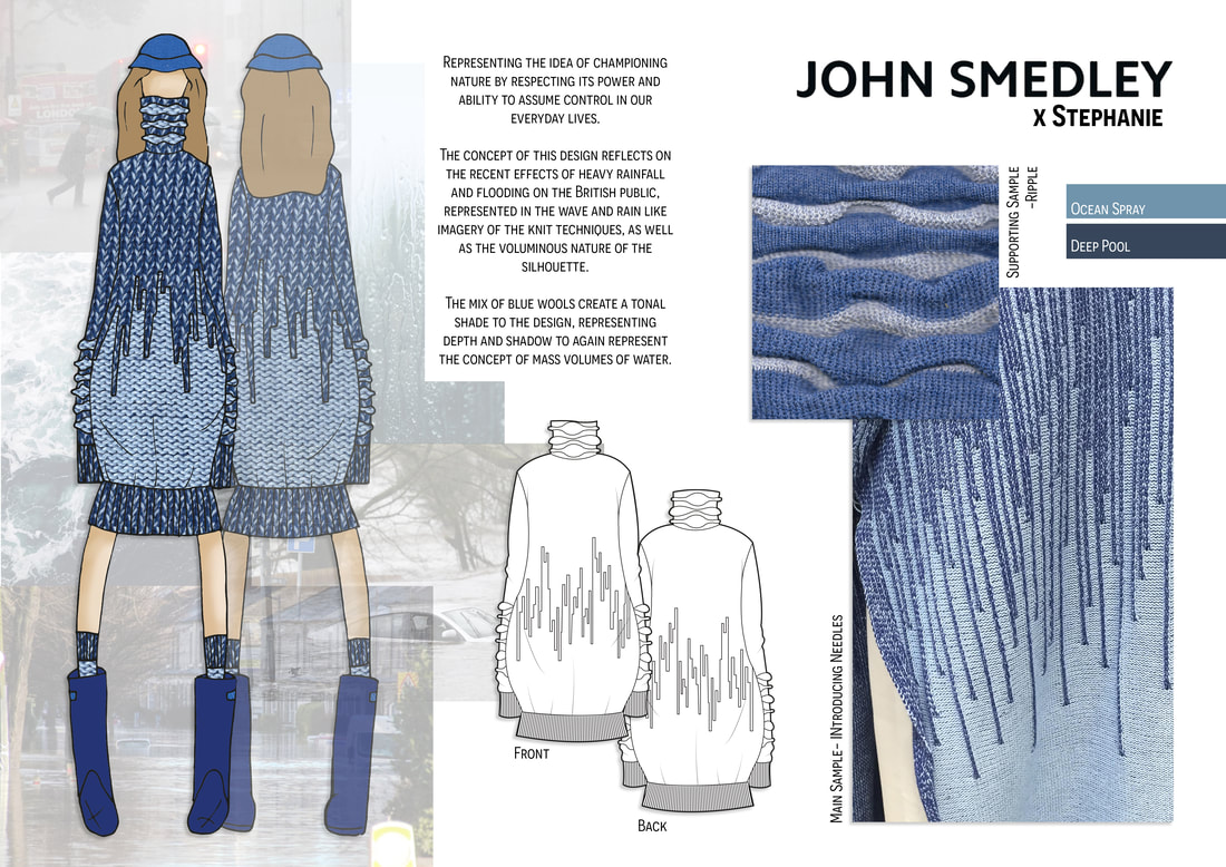
Final year also saw an opportunity to enter a knitwear competition with John Smedley; having done knitwear within my graduate collection I entered utilising the techniques I had learnt and following a similar concept with a tailored result for this entry. The brief was to create a knitted outfit that champions nature and considers sustainability, this competition came in associated with John Smedley’s involvement with Wool Week. For my entry I expanded on my concept of flood and created a knitted dress that reflects the concept in rain and wave knit techniques within a voluminous silhouette.
University of Derby x ASOS x Common Objective
In final year, the University of Derby collaborated with ASOS and Common Objective to create an ASOS based project with sustainable values. For this brief we were given the Autumn Winter trend ‘East Village’ which combines the rebellious nature of the East Village, New York with matrix vibes, clashing animal prints and leather; of which we had to develop this trend into our own concept and line-up.
With common objective in mind, I based my concept off the idea of rebellion bringing it from the East Village into the modern age with inspiration from Extinction Rebellion and protest culture. Considering the importance of clashing animal prints in the trend, I used this with my concept to combine animal prints with the theme of perspective and ‘not your skin’ to challenge how we see the use of animals in fashion. The fabrics in the collection are from sustainable sources, finding new sources of fur and leather used in the trend but from vegan sources to fit with my concept. The final line-up appeals to a new wave of modern consumers who both have an interest in streetwear style and are conscious about the world around them.
With common objective in mind, I based my concept off the idea of rebellion bringing it from the East Village into the modern age with inspiration from Extinction Rebellion and protest culture. Considering the importance of clashing animal prints in the trend, I used this with my concept to combine animal prints with the theme of perspective and ‘not your skin’ to challenge how we see the use of animals in fashion. The fabrics in the collection are from sustainable sources, finding new sources of fur and leather used in the trend but from vegan sources to fit with my concept. The final line-up appeals to a new wave of modern consumers who both have an interest in streetwear style and are conscious about the world around them.
Boots Uniform Redesign
During final year, I worked on a brief to reinvent the Boots uniform in line with the reinvention of their stores which has begun in Covent Garden and Meadowhall. To gain understanding of the brand, I investigated their current uniform and marketing as well as researching into their heritage as this is a major part of their brand in which they take pride in. I decided to focus this project on Boots Opticians, so specifically looked at their marketing and department within the reinvented stores.
With this information in mind, I took inspiration from their new marketing scheme and advert which encapsulates the idea of opulence and luxury to rival high end eyewear brands, using the slogan ‘They’re Boots Darling’; as well as research into 1980s fashion as a nod to Boots Opticians heritage with the first opticians opening in 1987. Combining these created my concept of luxury that takes inspiration from the wallpapers, prints and colours that can be seen in the advert and uses them within 80s inspired silhouettes to create a modern, eye catching uniform that fits with their reinvention. The colours combine bold colours of opulent interiors with lighter shades to ensure the uniform is suitable for year-round wear; all the colours have been taken from Boots existing branding to ensure they fit the brand. As well as colour, the line up uses print that takes inspiration from floral wallpapers, combined with glasses imagery as a nod to the optician sector.
With this information in mind, I took inspiration from their new marketing scheme and advert which encapsulates the idea of opulence and luxury to rival high end eyewear brands, using the slogan ‘They’re Boots Darling’; as well as research into 1980s fashion as a nod to Boots Opticians heritage with the first opticians opening in 1987. Combining these created my concept of luxury that takes inspiration from the wallpapers, prints and colours that can be seen in the advert and uses them within 80s inspired silhouettes to create a modern, eye catching uniform that fits with their reinvention. The colours combine bold colours of opulent interiors with lighter shades to ensure the uniform is suitable for year-round wear; all the colours have been taken from Boots existing branding to ensure they fit the brand. As well as colour, the line up uses print that takes inspiration from floral wallpapers, combined with glasses imagery as a nod to the optician sector.
2018-2019
Childrenswear Placement
Whilst on my Diploma in Professional Practice year in industry I worked with a childrenswear supplier; during this placement I carried out my own brief from research to design to sample production. I chose a trend from the M&Co Autumn Winter trend pack and worked through carrying out research including using WGSN and carrying out a comp shop; from this research I created a line-up of flat drawings utilising the colours provided by the trend pack. I then chose a couple of my designs to get made into samples, working through fabric selection and pattern cutting, as well as communicating with print and trim suppliers to get the materials needed for my designs. The samples were then made up by the inhouse sample machinists. I then also carried out a similar collection from the same trend, but this time for babywear.
2017-2018
University of Derby x Dimensions Corporatewear
Concept & Design Work
Technical Work
In second year, the University of Derby collaborated with Dimensions corporate wear, a uniform brand who design workwear for well-known companies including restaurants, high street retailers, supermarkets, and transport companies. The brief for this collaborative project was to design a six outfit line up for a uniform of the future in a chosen sector.
For my project I decided to chose to design a uniform collection for John Lewis, I chose them because I found it interesting that they did not already have a uniform since they are such a well-established company and take pride in their anticipated marketing and advertisement. I utilised these marketing campaigns as well as their partner company Waitrose to gather research and a greater understanding of how they portray their brand, of which inspired my collection.
The final collection utilises colours from their existing branding, as well as customer communications to help ensure it appeals to the customer. I have used branding subtly in the collection by inserting logos and associated shapes into panels within the silhouettes; this came as a response of a staff questionnaire I carried out that found 50% wanted a branded uniform and 50% did not, this way the uniform is branded to aid advertisement and identify the staff, without simply boldly displaying ‘John Lewis’. Other areas found in the questionnaire included requests to be able to wear knitwear and vest tops, both of which I designed into my collection while still respecting the modesty of uniform and professionally portraying the company.
I went on to have the opportunity to present this project to representatives at John Lewis while on placement with Dimensions in 2018 and received great feedback from both John Lewis and Dimensions.
